
my_notification = client.notify(
    title='My Notification',
    description='A description goes here',
    no_growl=True,
    icon='info'
)CocoaDialog Reference
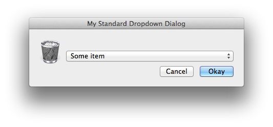
Global Icons
By default, the CocoaDialog application comes with several built in icons for your use.
These icons are meant to be used as values for the global icon parameter.
Mouse over any icon to view it's name...
Global Parameters
These parameters apply to most if not all dialog types.
If for some reason you notice that one of these options isn't working for your dialog type, try running the CocoaDialog wrapper with debugging enabled.
| Accepted Type | Description | |
|---|---|---|
| string | The title shown at the top of the dialog box | |
| boolean | Enable string output instead of dialog's default. For example, clicking on a button1 entitled "myButton" will return ["myButton"] rather than ["1"] |
|
| boolean | Disable newlines in dialog's label attributes | |
| integer, float | The desired width of the dialog in pixels | |
| integer, float | The desired height of the dialog in pixels | |
| integer, float | Distance away from the left side of the screen that the dialog should be spawned (in pixels) | |
| integer, float | Distance away from the top of the screen that the dialog should be spawned (in pixels) | |
| string | Icon (from global icons) that should be used in your dialog | |
| integer, float | Time until the dialog dies | |
| string | Format for displaying the time remaining in the timeout. Requires a string format character %s in order to show the time remaining |
|
| string | Use the icon of the passed bundle ID in your dialog | |
| string | Absolute path to the icon file to be used in your dialog | |
| integer, float | Size of icon in dialog (in pixels) | |
| integer, float | Height of your dialog's icon (in pixels) | |
| integer, float | Width of your dialog's icon (in pixels) |